

Mamy Hanai
We spoke to Mamy, a Japanese artist and designer who creates grotesque 3D characters in a renaissance color palette. She shared her design journey and how her early interest in music set her on the path to 3D design. Each of her creations uses a double-theme concept, illustrating the middle point between contrasting ideas through paradoxically repulsive and beautiful imagery.

Name, age, profession: please introduce yourself.
I was born in 1998, I work in 3d graphics and I’m based in Tokyo.

Where does your name come from?
I created my Instagram account around the time I was in high school or art school, and I named it Heptad, which means the number 7. I read in a book that it was a nickname, and I thought it was nice.

How did you get interested in design?
I have always been interested in design, since I was young, I guess. My parents were in a band, so we had a lot of band record jackets, CDs, and loads of movie DVDs at home. My interest in design happened pretty naturally.

What do your parents think about your work?
They are pretty chilled. As long as I’m happy and doing well they’re cool with it!

What was the first thing you saw that resonated with you, design-wise?
When I was in college, I came across this artist called SEVDALIZA. Even though they’re a music artist, when I saw the video for “That Other Girl” for the first time, it really impacted me. At the time, you’d rarely come across that sort of thing, but SEVDALIZA was really going for it with 3D design. The first time I saw the SEVDALIZA video, it was such a sensation. From then on I decided I was going to do [3D] design properly. Before that, I was just drawing pictures and stuff.

What was the first thing you designed?
The first thing that actually went out into the world, that I got money for, was the Odd Foot Works album cover.
How did that come about?
I got them when I was in art school, at the time I really liked the music and sound of Japanese bands. I was going to livehouses in places like Shimokitazawa in Tokyo. I used to go to all their shows - I was a massive fan - and we got talking. They asked what I did and then eventually they asked me to do their cover.
I was very happy because they were my favourite band. You don't really want to do something unless you like it, right? It was a massive motivation.

How has your style evolved since you first started?
It’s changed quite a bit. At first I started off doing collage. I’d buy old books then I’d cut and stick them to make a collage, but since then I’ve moved over to digital. The reason I changed is because I found a style I really liked at the time. The way that I want to express myself changes depending on the time (period).

Did you change it consciously?
Yes but also no.. If I try, maybe I can do it - I am always curious to see if I can actually do a particular style or design. I don’t always have a clear aim in mind from the start, but it’s always fun to just try it and see. From there the way that I want to express myself appears. Every time.

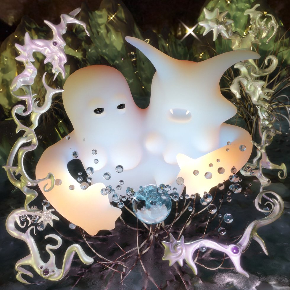
We love your melting mannequins. What made you decide to create them?
You can basically do [express] anything using 3D design. You can make anything from incredibly realistic models to delicious-looking doughnuts, so with such freedom to create, I began to think about what I wanted to express. From there, how about things that a human body can’t do? If a physical body gets holes in it, normally you’d die, but 3D allows me to express that. Then again, I didn’t want to create something merely 100% grotesque. I want to make it aesthetically pleasing, so it’s not simply disgusting but also beautiful.
Rather than creating happy things I tend to make them on the heavy side.

What do you use to design them? Talk us through your process.
I also use a software program called Daz3d that specializes in human bodies, and then I use Blender, which is more comprehensive, to create detailed expressions such as melting and so on.

Tell me one big influence on your designs.
I make sure to have two self-contingent concepts, - for example, nature, such as trees or grass, and then something man-made, such as buildings or machines. Then I try to blur the distinction between the two, without favouring one or the other, so we can appreciate both, and make people think about their value.
It’s an expression of blurring the line between natural and man-made, after eliminating the boundary between the two.
I decide on the two things and then paint the middle of them, like drawing the space between life, and death.
In fact, it’s got to the point where I don’t just use one theme anymore.

What are you working on at the moment?
I’m digging the texture of old 3D games right now. I'm currently working on 3D design that is a bit low-poly, trying my best to make it look a bit like old horror games, such as Silent Hill.

interview KIM KAHAN
What to read next


